Quick answer: Artist Personal Branding
undefined undefined undefined.
Quick Answer
A strong artist brand has three pillars: a consistent visual system (colors, fonts, imagery style), a clear narrative (who you are, why you make music, what you stand for), and platform-native execution (Instagram grids, TikTok aesthetics, VK community design). Artists with cohesive branding get 3x more playlist saves, 2.5x more social shares, and command higher merchandise prices than visually inconsistent peers.
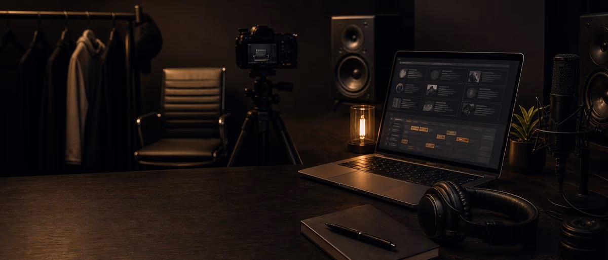
Building Your Visual System
Your visual system is the fastest way to communicate who you are. In 0.3 seconds — the time it takes to scroll past a post — viewers form an impression based on color, typography, and composition. A scattered visual identity (neon graphics one day, muted vintage the next) signals amateurism. A cohesive system signals professionalism before anyone presses play.
Start with a color palette: 1 primary color, 2 secondary colors, 1 accent. Tools like Coolors (free) generate palettes from reference images. Choose colors that match your genre's emotional tone — trap leans toward blacks, golds, and reds; indie folk toward earth tones and pastels; hyperpop toward neons and chrome.
Next, typography: one display font for headers (bold, expressive) and one body font (clean, readable). Free sources: Google Fonts, Font Squirrel. Avoid using more than 2 fonts across all materials. Your font choices should be legible at small sizes (Instagram profile, Spotify artist page).
| Genre | Color Direction | Typography Style | Visual Mood |
|---|---|---|---|
| Trap / Hip-Hop | Black, gold, red, dark green | Bold sans-serif, condensed | Luxury, danger, authenticity |
| Indie / Alternative | Earth tones, muted pastels | Handwritten or serif | Intimate, organic, nostalgic |
| EDM / Electronic | Neon, chrome, gradient | Geometric sans-serif | Futuristic, energetic, synthetic |
| R&B / Soul | Deep purple, burgundy, cream | Elegant serif or script | Sensual, warm, timeless |
| Pop | Bright primary colors, pastels | Rounded sans-serif | approachable, fun, youthful |
Your Artist Narrative: The Story That Sells
Fans do not buy music — they buy identity. They stream your track because it says something about who they are. Your narrative is the bridge between your music and their self-image.
The narrative framework has four parts: Origin (where you came from, what shaped you), Struggle (the obstacle you overcame), Transformation (how music changed you), and Mission (what you want listeners to feel). Example: 'Grew up in a Rust Belt town where the factory closed. Started making beats on a cracked laptop. Music became my escape — now I make tracks for everyone who feels stuck.'
This narrative should appear in your bio, your press kit, your About section on Spotify, and your pinned social media posts. Consistency matters — if your origin story changes across platforms, fans sense inauthenticity.
Platform-Native Brand Execution
Each platform has its own visual language. Instagram rewards curated grids — 9 posts that form a cohesive color story when viewed together. TikTok rewards raw, phone-shot authenticity — overproduced content underperforms. VK values text-heavy, meme-driven visuals with community interaction.
Instagram Grid Strategy
Plan your grid in 9-post cycles. Each cycle should tell a mini-story: 3 posts about the music, 3 posts about the person, 3 posts about the community (fan reposts, behind-the-scenes, shoutouts). Use a grid planning tool like Preview or Later to visualize before posting.
Color blocking works: post 3 warm-tone images, then 3 cool-tone, then 3 neutral. This creates a checkerboard effect that catches the eye when users visit your profile. Avoid posting 3 text-heavy graphics in a row — they create a 'wall of text' that drives visitors away.
TikTok Aesthetic
TikTok is the anti-curation platform. Users follow artists who feel accessible, not aspirational. Your brand here should be looser: bedroom recordings, unfiltered reactions, DAW screen recordings, day-in-the-life clips.
The key is recognizability within looseness. Use a consistent text font (CapCut has brand-friendly options), a recurring intro hook ('What's up, it's [name] and this is how I...'), and a signature visual element (colored LED lights, a specific background wall, a branded hat). These anchors let fans recognize your content instantly, even in a fast-scrolling feed.
VK Community Design
VK (VKontakte) is the dominant social platform for Russian-speaking music fans. An artist's VK community (group/page) functions like a hybrid of Facebook Page and Discord server. Design your VK community with: a branded cover photo (1590x400px), pinned post with streaming links, a 'Discuss' tab enabled for fan interaction, and regular wall posts with both music and lifestyle content.
Russian fans engage more with authentic, text-heavy posts than polished graphics. A handwritten note photo with a track announcement often outperforms a professional flyer. The tone should be conversational — ' dropping something new this week, who is ready?' beats 'NEW SINGLE OUT NOW.'
Essential Brand Assets Every Artist Needs
- Logo / Wordmark
A simple, scalable logo that works at 50px (Spotify artist page) and 5000px (merch print). Can be text-only or symbol + text. Avoid complex illustrations — they do not scale down. - Profile Photo System
Same photo across all platforms: Spotify, Apple Music, Instagram, TikTok, VK, YouTube. Update it simultaneously every 6–12 months. Fans should recognize you instantly on any platform. - Cover Art Template
A reusable template for singles and albums. Same font, same color treatment, same layout grid. Only the photo and title change. This creates visual continuity across your catalog. - Press Kit (EPK)
One-page PDF with: bio (150 words), photos (3 high-res), streaming stats, contact info, and social links. Send this to blogs, playlist curators, and venues. Update quarterly. - Social Media Templates
Pre-made templates for announcements, release days, thank-you posts, and tour dates. Tools: Canva (free), Adobe Express (free). Having templates prevents last-minute, off-brand designs. - Merch Mockups
Even if you are not selling merch yet, create mockups of 3 items (t-shirt, hoodie, sticker). This signals to fans and industry contacts that you are thinking beyond streaming. Use Printful or Printify for zero-inventory mockups.
The 90-Day Consistency Rule
Branding is not a one-time design project — it is a behavioral commitment. Studies of artist growth on Spotify and Instagram show that 90 days of consistent visual and tonal output is the threshold where algorithms begin favoring your content and fans begin recognizing your brand unprompted.
The consistency checklist: post 1x daily on Instagram (stories count), 2–3x daily on TikTok, 3–5x weekly on VK, maintain the same color palette across all graphics, use the same 2–3 fonts, reply to comments within 2 hours, and update Spotify/Apple Music artist bios monthly.
After 90 days, audit your analytics. Which posts had the highest save/share rates? Which colors performed best? Which narrative themes resonated? Use this data to refine, not replace, your brand system.
Need visual tools to build your brand? Browse our free design resources and start crafting an identity worth remembering.
Browse Free DownloadsLearning path
Related answer hubs
Frequently Asked Questions
- Do I need a professional designer to build my artist brand?
- Not initially. Canva, Adobe Express, and free font libraries give you 80% of what a $500 designer would produce. Invest in professional design only after you have 1,000+ monthly listeners or are preparing for a major release. Until then, consistency beats polish.
- Should my producer brand differ from my artist brand?
- Yes, if you do both. Producer branding should be clean, technical, and professional — focused on sonic quality and reliability. Artist branding should be emotional, narrative-driven, and personality-forward. Use different color palettes and social accounts to avoid confusing buyers (artists looking for beats vs. fans looking for songs).
- How often should I rebrand?
- Minor refreshes every 12–18 months (new profile photo, updated color tones). Major rebrands every 3–5 years or after a significant career shift (signing to a label, genre change, viral breakthrough). Avoid rebranding during growth phases — it confuses new fans who just discovered you.
- Can I build a brand without showing my face?
- Yes — many successful artists (Marshmello, Daft Punk, Sia) built brands around masks, helmets, or anonymity. The trade-off: you lose the personal connection that drives fan loyalty, so you must compensate with stronger visual iconography (logo, color, costume) and more frequent community interaction.
- What is the biggest branding mistake new artists make?
- Copying a successful artist's aesthetic exactly. Fans can spot a Travis Scott clone or Billie Eilish derivative instantly. Take inspiration from their systems (consistent palette, narrative depth, platform strategy) but translate it through your own identity. Originality is the only sustainable brand asset.