Producer website accessibility
undefined undefined undefined.
Quick Answer
Treat your beat store like a product that must work without perfect vision, hearing, pointer precision, or a mouse. Aim for WCAG 2.2 Level A and AA on core paths: keyboard-operable player and cart, 4.5:1 text contrast, labeled forms, visible focus, captions/transcripts for key media, and no keyboard traps in custom audio UI.
Why Beat-Store Accessibility Is a Sales Issue
Producer sites fail accessibility in predictable places: a custom waveform player that only works with a mouse, lease buttons with gray-on-gray type, checkout forms without labels, and modals that trap keyboard focus. Those are not edge cases — they are lost leases and support tickets.
WCAG 2.2 (Web Content Accessibility Guidelines) is the practical standard most teams target. You do not need a perfect AAA audit on day one. You do need Level A and AA coverage on the paths that make money: browse → play → choose license → pay → download.
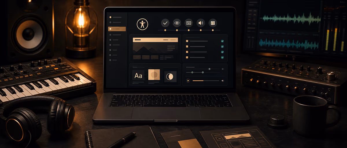
This guide maps concrete WCAG-oriented requirements to beat-store UI components. It is operational guidance for builders and store owners, not a formal certification. When you redesign, keep brand energy — just stop encoding that energy only in low-contrast neon on black.
WCAG 2.2 A/AA Map for Beat-Store UI
| Store surface | WCAG theme (A/AA) | What “pass” looks like | Common fail |
|---|---|---|---|
| Global nav / search | Keyboard, name/role/value, focus visible | Tab order matches visual order; search field has a name | Icon-only buttons with no accessible name |
| Beat cards / grid | Info and relationships, contrast | Title, BPM, key readable; price not color-only | Hover-only titles; neon on near-black below 4.5:1 |
| Audio player | Keyboard, no keyboard trap, labels | Play/pause/seek via keyboard; status announced or visible | Canvas player with zero keyboard support |
| License tier picker | Labels, error identification | Each tier is a real control with clear name/price | Clickable divs without roles; unclear selected state |
| Cart / checkout | Forms, errors, consistent navigation | Labeled inputs; errors in text; focus moves to first error | Placeholder-only labels; red border only |
| Download area | Link purpose, status messages | Link text says what file/license; success message not toast-only if it disappears instantly | “Click here” for stems vs MP3 |
| Promo video / reels embed | Captions / media alternatives | Captions or transcript for spoken promo content | Autoplay sound with no stop control |
| Contact / collab forms | Labels, autocomplete where relevant, target size (2.2) | Name/email labeled; submit large enough to hit | Tiny custom checkboxes |
Prioritize by funnel impact: player + license CTA + checkout first, marketing chrome second. A beautiful hero that fails contrast is less damaging than a cart that cannot be completed with a keyboard.
Audio Player, Cart, and Keyboard Paths
Custom players are the #1 accessibility debt on beat stores. Waveform UIs are fine if they still expose real controls.
- Play / pause Must be a focusable button with an accessible name that reflects state (“Play beat” / “Pause beat”). Space/Enter toggles when focused.
- Seek Provide a slider or skip controls reachable by keyboard. If the waveform is mouse-only, add previous/next 5s buttons as a fallback.
- Volume / mute Do not rely on device keys alone. Include mute and a volume control with a name; avoid surprising autoplay with sound.
- Now playing Visible text for track title. If the player is sticky, ensure it does not cover focusable content without a way to dismiss or skip past it.
- No keyboard trap Tab must be able to leave the player into the license buttons and page nav. Modal players must trap focus only while open and restore focus on close.
- Cart quantity and remove Each control named; removing an item should not drop focus to the top of the document without reason.
- License radios/cards Selected tier announced via native radio semantics or aria-checked with a clear label including price and key limits (streams, videos, etc.).
- Keyboard-only smoke test
Unplug the mouse. From the homepage, reach a beat, play/pause, open license options, add to cart, open cart, and focus the pay button. - Screen reader spot check
With VoiceOver, NVDA, or TalkBack, confirm beat titles and prices are announced, not only “button, button, button.” - Sticky player check
With the player open, tab through the page and confirm you can reach footer links and that the player does not permanently obscure CTAs on mobile.
Contrast, Forms, Focus, and Motion
| Requirement area | Practical target | Beat-store example |
|---|---|---|
| Text contrast (AA) | ≥ 4.5:1 for normal text; ≥ 3:1 for large text | BPM/key metadata, license fine print, form errors |
| UI component contrast | ≥ 3:1 for meaningful icons/borders | Play icon on cover art; focus ring visible on dark UI |
| Color not sole cue | Pair color with text/icon | “Sale” not only red price; errors not only red outline |
| Labels | Visible label associated with input | Email, discount code, artist name on invoice fields |
| Focus visible | Clear focus indicator on all interactive elements | Never remove outline without a stronger custom focus style |
| Target size (2.2) | Adequate hit area for pointer users | Mobile lease buttons and player controls |
| Motion | Respect prefers-reduced-motion | Disable infinite waveform bounce / parallax if user requests reduced motion |
| Timeouts | Warn before session expiry when possible | Cart/session timeouts during checkout |
Dark trap / drill aesthetics can still pass AA. Raise text luminance, thicken focus rings, and avoid pure #111 on #000 for body copy. Use brand neon for accents, not for 12px legal text.
Forms that convert for everyone
Every field needs a persistent label (not placeholder-only). Mark required fields in text. On error, list what failed in text near the field and move focus to the first invalid control. Autocomplete attributes on email/name help users with saved data and some assistive tech.
If you use CAPTCHA, provide an accessible alternative. A lease lost to an unsolvable puzzle is still a lost lease.
Media, Images, and Content Patterns
- Cover art alt text Describe meaningful art briefly (“Cover art: neon skyline for the beat Midnight Run”). Decorative spacers can be empty alt.
- Beat titles as text Do not put the only track title inside an image. Screen readers and SEO both need real text.
- Promo videos Captions for spoken content; visible pause control; no unexpected loud autoplay.
- License PDFs Provide HTML FAQ summaries for key terms; PDFs should still be tagged when possible. Link clearly: “Full MP3 Lease PDF.”
- Live waveforms Treat as decorative if controls exist elsewhere; do not require sighted interpretation of a waveform to know playback position — expose time text (0:32 / 2:14).
Lightweight Audit Checklist You Can Run Monthly
- Automated pass
Run axe, Lighthouse accessibility, or equivalent on home, beat page, cart, checkout, download. Fix critical issues first. - Keyboard pass
Full purchase path without a mouse on desktop; basic play and license select on mobile with external keyboard if you have one. - Contrast pass
Spot-check body, metadata, buttons, and footer legal links against AA ratios. - Form pass
Submit empty checkout/contact forms and confirm text errors + focus management. - Player pass
Play, pause, seek fallback, mute, escape from sticky/modal player. - Document exceptions
If a third-party embed fails WCAG, note it and add an accessible alternative path (e.g. direct audio link).
Common Mistakes
- “We’ll fix a11y after launch” Custom players and design tokens are expensive to retrofit. Bake focus and contrast into the component library.
- Removing focus outlines for aesthetics Keyboard users get lost. Replace with a high-visibility custom ring if you hate the browser default.
- Placeholder-only forms Placeholders disappear on type and are weak labels. Use real
- Color-only sale or error states Pair with text (“Sale”, “Card declined”).
- Assuming all buyers are mouse-first gamers Producers buy on laptops, phones, and assistive tech. The path must be boringly robust.
- Autoplay audio Unexpected sound is a WCAG and courtesy problem. User-initiated play wins.
Improvement Loop After Each Store Redesign
Every time you change the player, theme tokens, or checkout, re-run the keyboard and contrast passes before shipping. Log issues in a simple sheet: page, component, severity, WCAG theme, owner, fix date.
If you use BeatStars, Airbit, or another hosted store, you may not control every widget — but you still control cover text, license FAQ copy, external landing pages, and which embeds you promote. Push vendors for accessible players; provide accessible alternatives on your own domain when you can.
Pair this work with a clear license FAQ and solid producer website structure so legal clarity and technical access improve together.
Build a cleaner store path — then stock it with free verified tools and samples from Plugg Supply.
Browse Free DownloadsLearning path
Related answer hubs
Frequently Asked Questions
- What WCAG level should a beat store aim for?
- Target WCAG 2.2 Level A and AA on browse, play, license select, checkout, and download. AAA is optional polish, not the first milestone.
- Is a custom waveform player allowed?
- Yes if play/pause, seek (or skip), and mute are keyboard accessible, named, and do not trap focus. Provide visible time text, not waveform-only position.
- What contrast ratio do I need?
- For AA, normal text should meet at least 4.5:1 against its background; large text and many UI components can use 3:1. Check metadata and legal fine print, not only headlines.
- Do producer websites legally require WCAG?
- Requirements vary by country, size, and whether you sell to the public. Regardless of mandate, accessible stores sell to more people and reduce friction. This guide is not legal advice.
- How do I test without an expert?
- Run automated checks, then a full keyboard-only purchase path, then a short screen-reader spot check on beat title, price, and form errors.
- What about third-party checkout widgets?
- Test them anyway. If they fail, document the gap, choose better vendors when possible, and keep your own pages and license explanations accessible.